
London, United Kingdom
Deliveroo – Designing from the Saddle
Overview
What happens when a product designer becomes an everyday user of the systems they’re interested in improving?
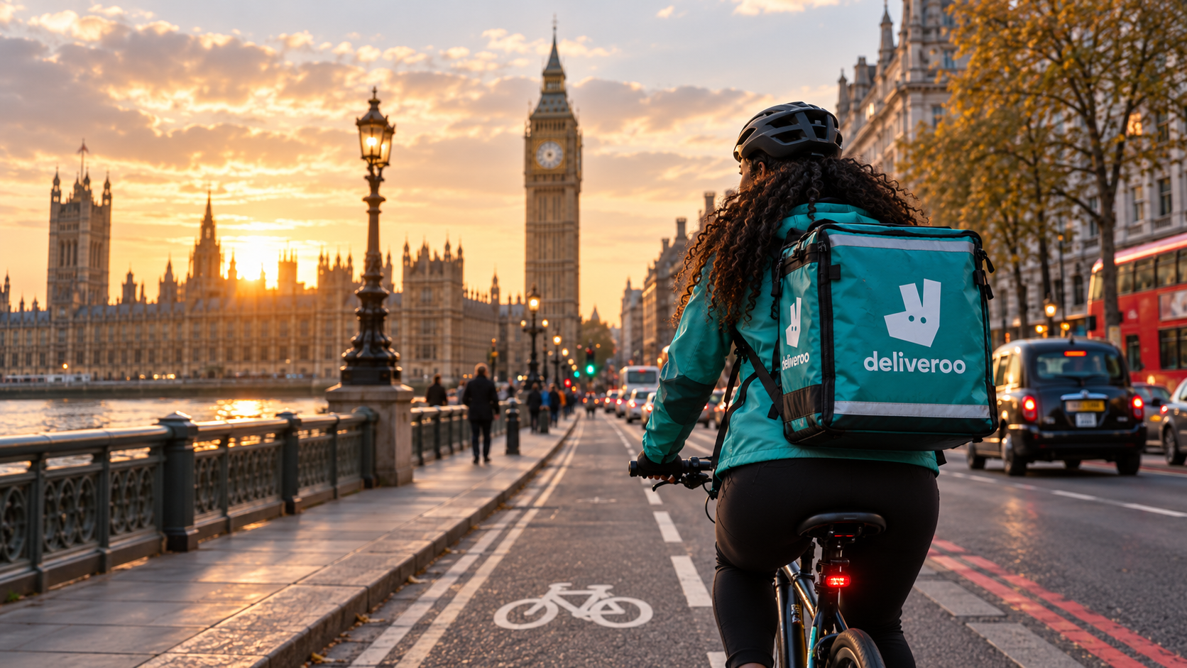
For several years, I’ve worked part-time as a cycle courier, primarily with Uber Eats, alongside my career in technology and product design. What began as an enjoyable way to exercise, explore London and earn additional income has gradually become an opportunity to observe digital products from a completely different perspective.
I’ve also delivered with Just Eat and have more recently started working with Deliveroo.
Each platform approaches the courier experience differently, from accepting orders and navigating unfamiliar streets to understanding demand across different areas of London.
As a product designer, I’m naturally curious about the decisions behind these experiences. Why are maps presented in particular ways? How much information does a courier need at any given moment? And how might small improvements to navigation reduce uncertainty and make a demanding job more intuitive?
Designing from the Saddle is my independent exploration of these questions.
Rather than beginning with a proposed solution, I’m using my experience as a courier to investigate real-world interactions, identify opportunities for improvement and develop evidence-led design concepts.
Navigating London’s delivery economy through the eyes of a product designer and cycle courier.
An independent UX research and product design case study exploring navigation, mapping and the experience of working across on-demand delivery platforms.
Role: Senior Product Designer, UX Researcher & Cycle Courier
Platforms explored: Deliveroo, Uber Eats & Just Eat
Project type: Independent UX research and concept design
Status: Discovery in progress
Location: London, United Kingdom
01 From Behind the Screen to Behind the Handlebars
The inspiration
Working as a cycle courier has given me an interesting perspective on the relationship between digital interfaces and physical environments.
Unlike many digital products, courier applications are used while people are navigating an unpredictable world: changing traffic conditions, unfamiliar neighbourhoods, busy restaurants, difficult-to-find entrances and time-sensitive deliveries.
An interface that appears straightforward in a controlled environment can feel very different when you're trying to make a decision on a cold London morning.
Over the years, I've encountered various navigation-related frustrations while delivering with Uber Eats and Just Eat. These experiences have made me particularly interested in how delivery platforms communicate location, direction and relevant information.
More recently, I began exploring the Deliveroo rider experience, curious to understand how another major delivery platform approaches similar challenges.
First impressions: observations worth investigating
Although I've only completed a few Deliveroo shifts so far, I've already identified several areas I'd like to explore more closely.
01. Map readability and visual hierarchy
One of my earliest impressions of the Deliveroo rider application concerns its map colouring.
At times, I find the colour treatment makes the information more difficult to interpret quickly than I would like.
This raises questions about visual hierarchy, colour contrast and the clarity of location-based information.
I'd like to investigate whether this is simply a matter of familiarity with the interface or whether other couriers experience similar difficulties.
02. Understanding changing delivery areas
Another area I'm curious about is how the app communicates changes as a courier moves between locations.
In my initial experience, I've found myself going offline and back online to see updated information about the area I'm in.
Ideally, I would like relevant area information to update automatically as I move, without requiring this additional interaction.
I'm interested in investigating whether this behaviour is consistent, what triggers updates and how the experience could potentially be improved.
03. Keeping essential information accessible
My previous experience with Uber Eats provides another useful point of comparison.
I've encountered situations where the delivery address is no longer displayed as expected after accepting an order, making it harder to refer back to that information during the delivery journey.
Interestingly, I haven't experienced the same issue with Deliveroo so far.
This is a positive aspect of my initial experience and an important reminder that research should identify what works well, not simply what needs improvement.
It also raises a broader design question: how can delivery applications maintain access to essential information throughout changing stages of an order?
Separating observation from assumption
These are preliminary observations drawn from my personal experience, not validated research findings.
I haven't yet established how frequently these issues occur, whether they affect other couriers or whether differences might be explained by device settings, location, platform behaviour or familiarity.
That's exactly why I want to conduct this research.
My goal isn't to prove that a particular application has a problem. It's to understand how couriers interact with navigation tools and identify opportunities to make those interactions more effective.
The Research Question
How might we improve the clarity, continuity and usability of navigation experiences for cycle couriers working across London's on-demand delivery platforms?
To explore this, I want to understand:
- How couriers interpret location and demand information before accepting orders.
- How navigation experiences change between pickup, transit and delivery.
- Whether map colours and visual hierarchy support quick comprehension.
- How applications communicate changes in location and delivery areas.
- Which information couriers need to access consistently throughout an order.
- What different platforms already do particularly well.
My Research Approach
I intend to use a combination of firsthand observation, comparative analysis and usability testing.
Phase 1 — Field observation
Document my experiences during normal courier shifts, focusing on navigation decisions, information availability, map interpretation and moments of uncertainty.
Phase 2 — Comparative UX analysis
Explore how Deliveroo, Uber Eats and Just Eat approach similar navigation tasks, identifying differences in their interfaces and user journeys.
Phase 3 — Courier research
Where possible, gather perspectives from other couriers to understand whether my experiences are shared and discover challenges I may not have encountered.
Phase 4 — Problem definition and design exploration
Synthesise the findings, prioritise meaningful opportunities and develop user journeys, wireframes and interactive prototypes.
Phase 5 — Usability testing and iteration
Evaluate potential solutions with participants, document feedback and refine the designs based on evidence.
Where the Project Stands Today
I'm currently waiting for my Deliveroo background checks to be completed again before returning to regular shifts.
In the meantime, I'm documenting my initial impressions, defining my research questions and preparing a structured field study for when I'm back on the road.
I see this as an opportunity to apply the same curiosity that has shaped my career in product design to an environment I know firsthand.
My intention isn't to redesign an entire delivery platform or assume I already know the answers.
It's to explore how thoughtful, human-centred design might make life a little easier for the people navigating our cities every day.
Next: Part 2 — On the Road: Field Research, Courier Journeys and Navigation Findings
This is an independent, self-initiated research project. It is not commissioned by, affiliated with or endorsed by Deliveroo, Uber Eats or Just Eat. All observations reflect my personal experience unless otherwise stated.